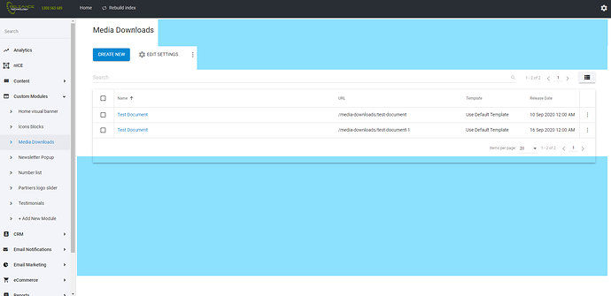
Custom Modules > UI > Compact List View
List view is too padded
Have an option for “Compact View for List Items” similar to Gmail.
Would mean we are able to view more information on the screen, which is especially handy for custom modules that have a lot of items.
================================================
I’m not sure who suggested this, but I support it.
There is a lot of “white space” or “empty real estate” on the user interface.
Everything Blue is space that could be better utilised
here is an example


