Payment Forms New Method

We are working on a payment form (stripe) using the new form method at https://theasdclinic.treepl.co/member-sign-up

The UX of the credit card fields is quite bad out of the box. Customising via CSS seems difficult.

Any idea on how we can improve the UX of those form fields?

There’s a new option now when setting up the gateway to control these styles:
Under: ‘Settings’ > ‘Payment’ > Add/Edit Gateway

Adam, thank you. Your help is much appreciated.

Hi Adam
I also have the same issue - but not sure what I need to adjust once I am " Settings’ > ‘Payment’ > Add/Edit Gateway" to overcome this problem. Please could you advise. Thank you

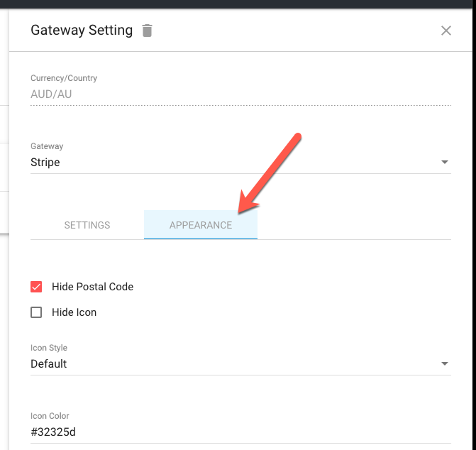
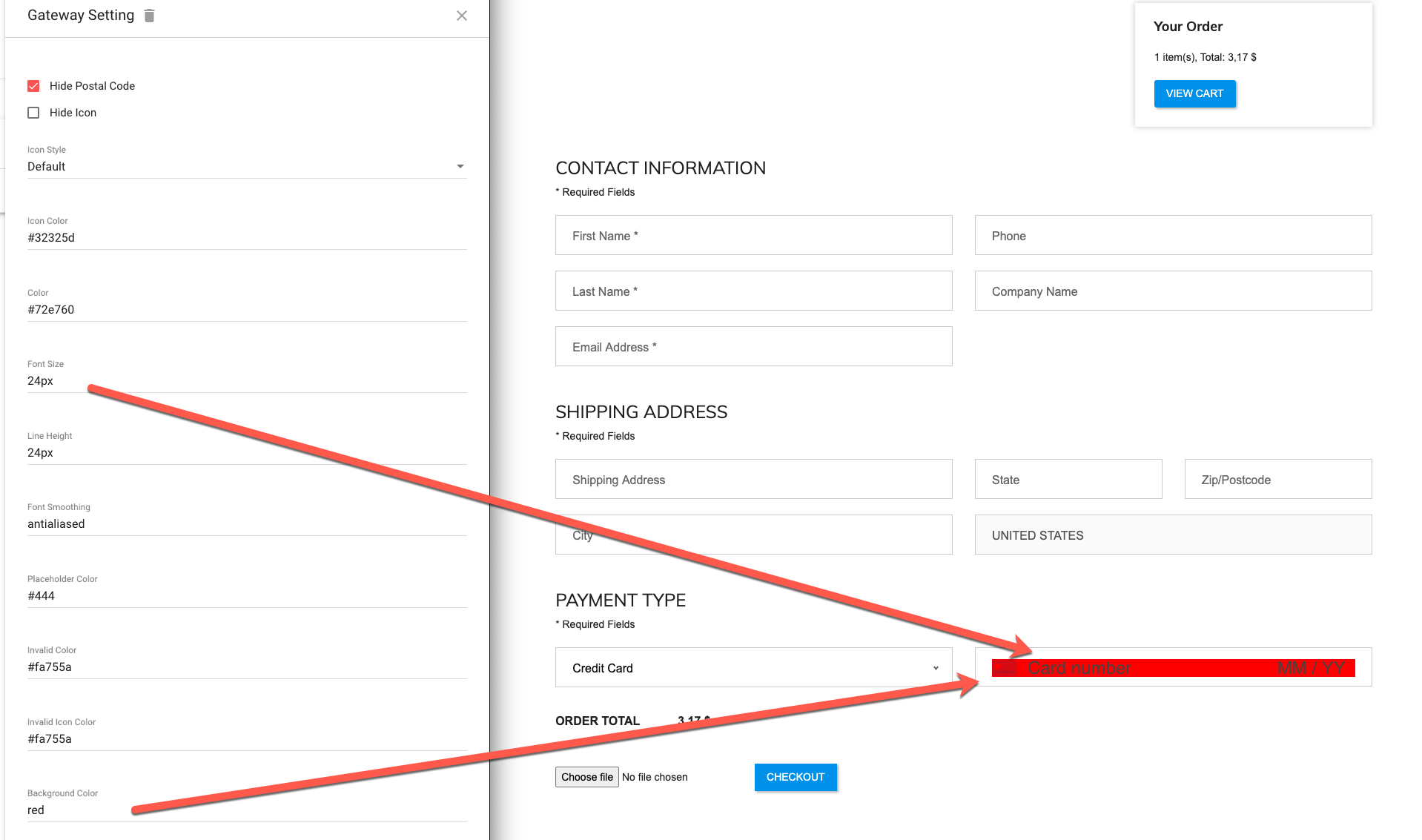
Hi @Dawn. If you click the pencil icon against your payment gateway and then click on the ‘Appearance’ tab (as pictured above) you will have a bunch of style options to adjust. It’s basically colours and font settings to adjust the CSS used for the field styling.

Hi Adam
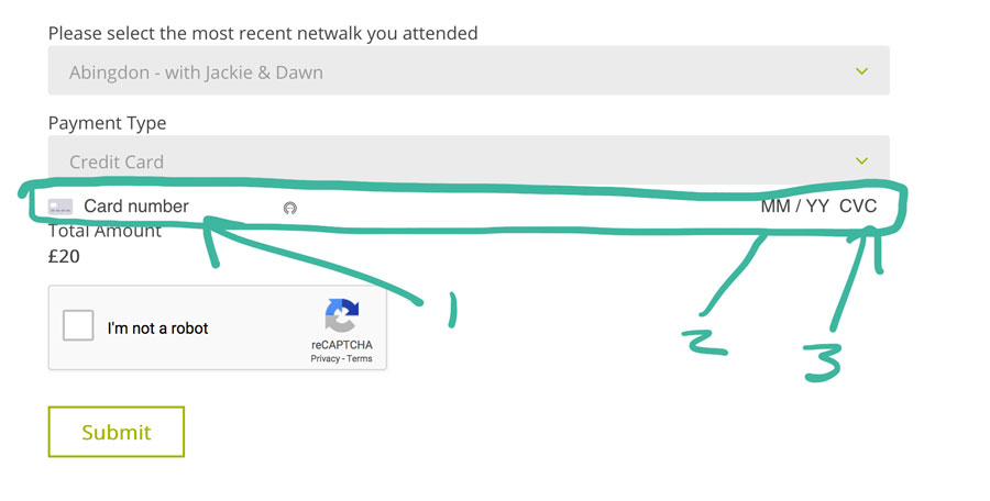
It is the actual area where you enter you credit card details, that we are trying to adjust as customer are missing that these are live fields you use to enter your - 'Card Number / Card date / card CVC

Yes, that’s right. Those style settings control the look of those fields:

NOTE: each gateway will have its own set of styles available (if any). So Stripe will differ from eWay, but the principle is the same.

Hi Adam

Do you know how I can adjust the depth of the box so that it matches the boxes above instead like on this page

https://naturalnetwalking.co.uk/individual-monthly-membership
Thank you
Dawn

Assuming you are using Stripe, increasing the ‘Line Height’ setting should do it.
You’d probably need line height to be around double the font size.

Wonderful, thank you so much, that fixed it.
Best wisehs
Dawn