Functionality wise, this is a great feature that will be received well.
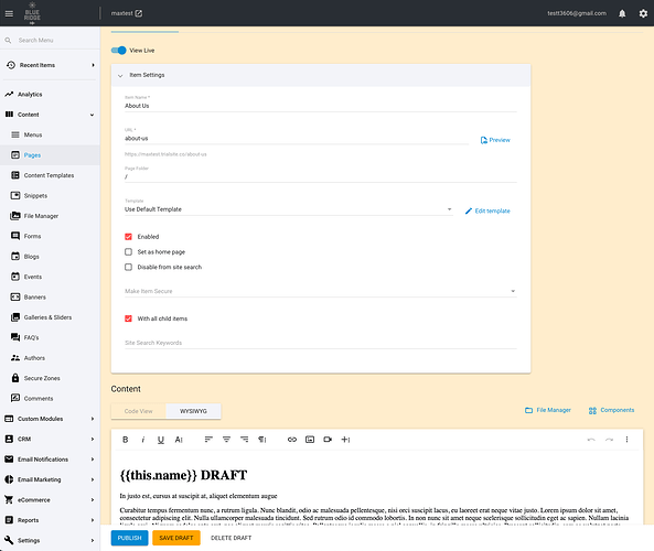
However, I feel that the draft mode is going to be visually confusing for users and cause a lot of accidental overrides to live and draft content and therefore create user frustration.
My proposed solution would just be to make the UI much more visually obvious when you are in Draft Mode. Perhaps an accented colour background to the edit page and matching colour ‘SAVE DRAFT’ button so it’s really clear 1) that you are in Draft Mode and 2) where to click to save the draft (instead of accidentally publishing it).
The current toggle switch at the top of the edit page will get lost and will be out of sight in most cases when it comes time to save the item.
While in Draft mode, the save shortcut (in Code View) of “Ctrl/Cmd + S” publishes the draft.
I feel that the save shortcut should instead just keep saving the draft since that’s the primary action you would take when editing a draft. Publishing is a final step that clears out the draft version so I think this would be a secondary action.
As someone who uses the save shortcut all the time, I can see myself accidentally overriding the live version all the time because I’m in the habit of just saving via the shortcut.
Example:
