Can we give some ideas on the rebrand or has it already been confirmed?
I would love to help as I agree the whole brand is due for a refresh.
It needs work as I only put an hour into it.
Can we give some ideas on the rebrand or has it already been confirmed?
I would love to help as I agree the whole brand is due for a refresh.
It needs work as I only put an hour into it.
Sure! We’d love to hear as much feedback as possible.
I like how Webinone sounds as a single word (wɛbinʌn)
I had an idea of having an official name as Web-In-One (wɛb ɪn wʌn) for end users, but use Webinone (wɛbinʌn) for Partners, but I don’t know if it would work in the real world.
Nice work @luke
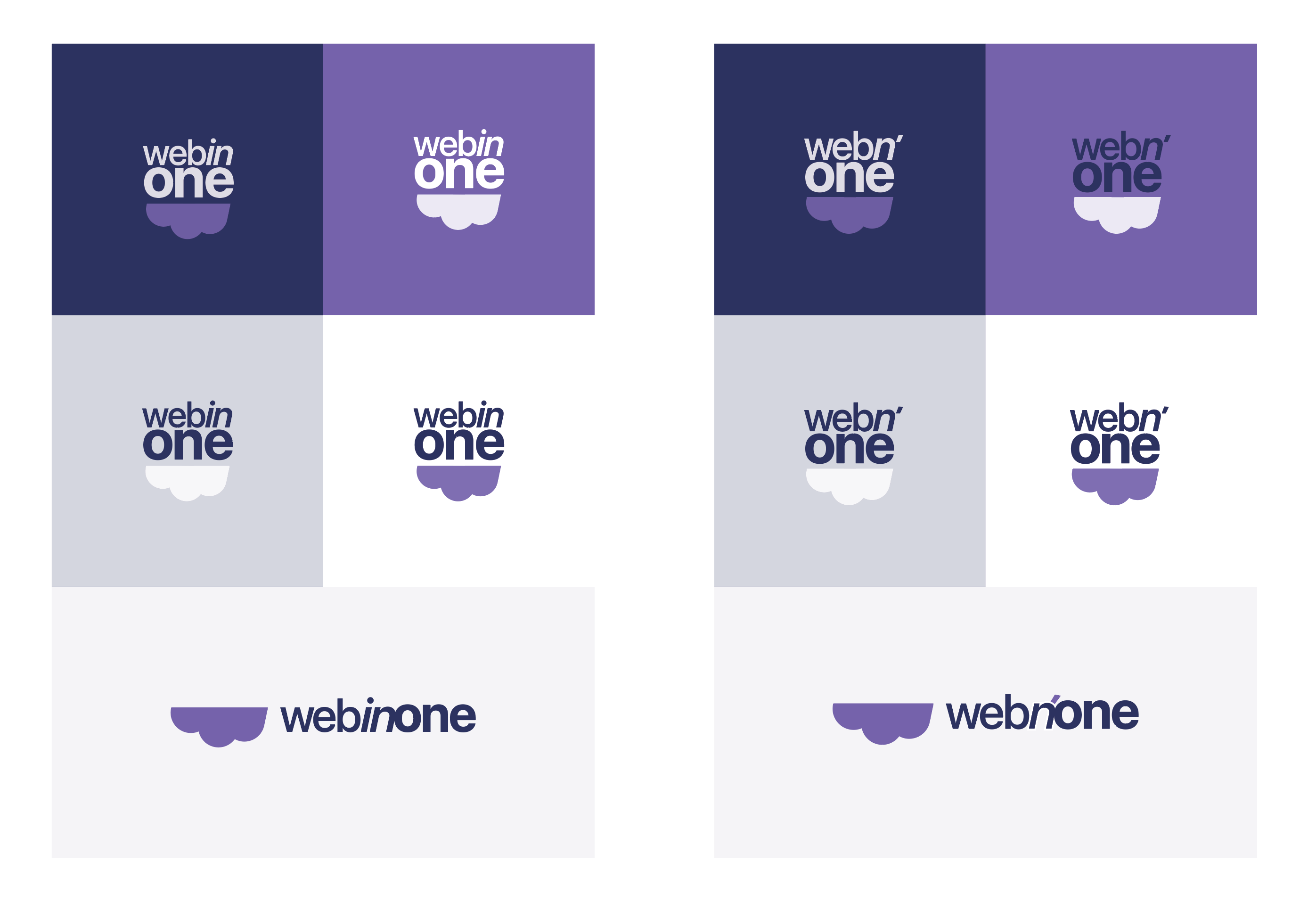
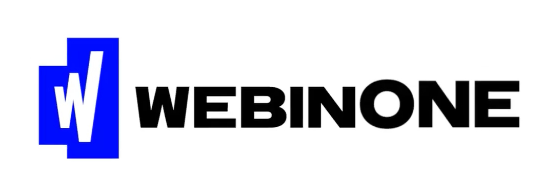
Personally, I like where the proposed branding is at, as it’s strong and simple. I just feel the confusion with correctly reading the name is the only issue and this might be solved with some minor tweaks, such as:
Or to mimic the ‘movement’ in the “W” icon:
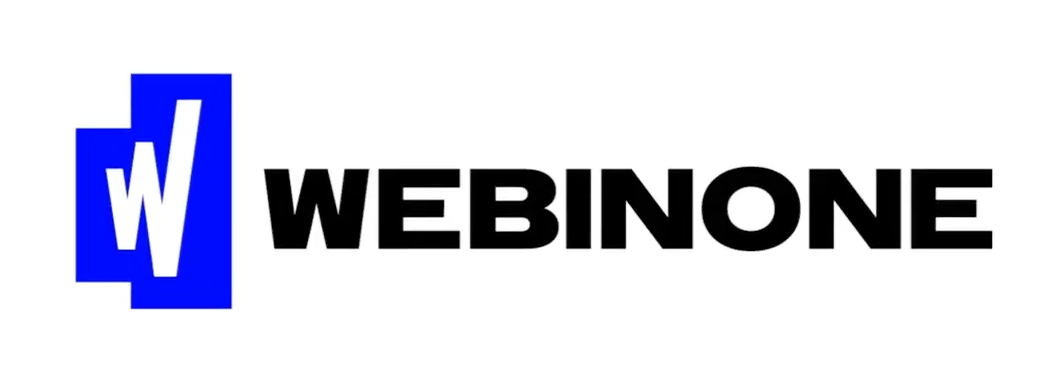
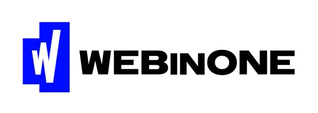
For reference, below is the original proposed logo from the presentation:
(NOTE: the blue in my mockups was just a result of accidentally converting to CMYK. I prefer something closer to the original blue. But any strong tone of blue will stand the test of time IMO)
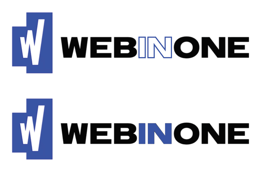
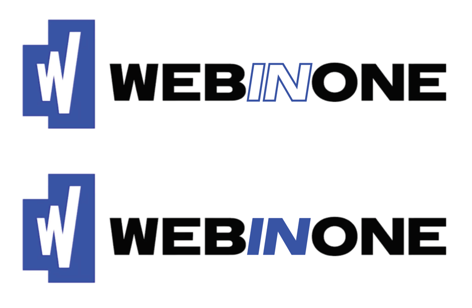
Then, I guess there is the question of how this is written in plain text to avoid the same issue?
Perhaps; WEBinONE
@alex, @Adam.Wilson Nice. Your WEBinONE text gave me an idea. What if it is just a subtle size shift in the font? But I agree. I really like the logo. I think it feels established and confident. Like, are you ready to go one-on-one with WEBinONE? Ring the bell let’s do this…
@alex @Adam.Wilson
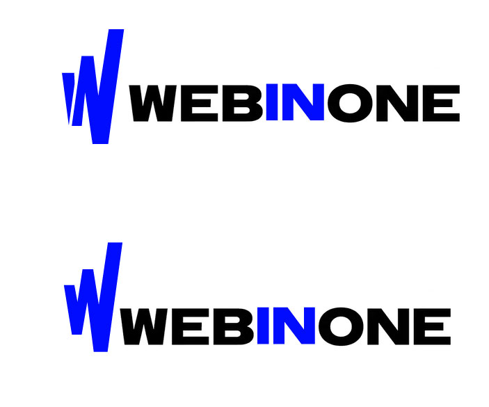
Hi Adam … yep think you are on to something but wondered if the logo could be simpler …
I split the logo to resemble “in” but I think I still prefer the simplicity of the original in reverse like the bottom option …
Ooh, I like the split ‘W’. Very clever ![]()